|
Upon my discovery of this video, I was immediately drawn to the beautiful use of color in this piece, as well as some of her others, her way of blending the blue into pink around the edges of the flowers was a brilliant idea! If this painting was done solely in blue, it still would have looked nice bu I think the pin definitely gave it something extra. This was one of my first realizations of the extent that you can go with using watercolor, having mostly used it to play in elementary school, I never saw much potential in it. She as taken watercolor to a new and beautiful level and inspired me to try some in my sketchbook. It as a nice experience to watch the painting come to life bit by bit. This artist, Sanjana, has inspired me to try watercolor in a new sophisticated way and given me some insight into our upcoming study of color theory!
0 Comments
On Ukraine's got Talent, there was this young lady telling powerful stories by drawing in sand. This amazing artist, Kseniya Simonova, has the ability to make the audience cry by drawing in sand. She draws in the sand to create a scene and then either changes it to create the next scene or swipes it all away to create a very different scene. She somehow has managed to create intense emotional through a temporary piece of art. Her form of story telling is incredible and it keeps your attention until the end, it enticed me. I can't imagine how talented she must be to create all of these scenes on the same area without ever messing up and creating each scene as beautifully as the last and very quickly as well, she creates beauty out of a blanket of sand in moments. Not only are the works beautiful, but they're very powerful, in this video, you can see many of the audience crying during the performance. Even though her sand-art is very emotional, I don't think that it would be nearly as emotional without the music there to aid it. Regardless, this lady's talent amazes me through her ability to create art so well and fast as well as her amazing ability to invoke feelings and emotion into the audience. We went on a walking field trip to see some different uses of color. These artworks showed that color is a very important aspect of art and that it should be chosen and applied delicately and thoughtfully. I liked the first exhibit a lot more than the second one, however, because the second one was a little too abstract for my taste. Though I didn't think that the second exhibit was quite as aesthetically pleasing, it still showed a very interesting use of color. The layering of the colors was a lot more prominent in this exhibit and the art relied mostly on the color, whereas the other exhibit also relied a lot on form. I found it very intriguing how the second exhibit used different mediums and layering in the work, like some sort of cardboard as well as other fabrics and paper. It also led me to see how certain colors just work better with other colors and how different shades of the same color can be used to accent. Also, I noticed that the majority of the time, the colors seem balanced in a way, and two of the same color aren't typically placed right next to each other, there isn't a main concentration of one color in any large part. I preferred the first exhibit though, the under-painting was incredible! I had never really seen the point of under-painting before this exhibit, but it really helped with the scenes and made them a lot more realistic. I learned that the under-painting is achieved by painting lightly overt the color that was already there, leading to a sort of blended look. I also found the counter-change in these pieces very interesting and I liked his utilization of circles and other shapes. In a broader sense, I really liked the different use of colors between the two exhibits. The first exhibit used the color mainly to add a little more to the painting or make it seem more realistic, while the second exhibit depended much more heavily on the color, but the colors were still placed very carefully, even though thy didn't serve a larger purpose other than to exist, they weren't building on form or showing perspective, they were just there to be pleasing. It's amazing how these two exhibits both relied on color but used the color in very different ways. I'm excited to learn about color theory and utilize both uses of color, especially the counter-change idea! 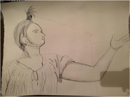 Post #4: Other than adding a very few last touches, I'm done with the project. I'm not happy with it because my shading was much too bold and it wasn't as loose as it was supposed to be, which I believe is due to the fact that the angel in the original was wearing a loose fitted dress.
These two readings both focused on the use of art during the cold war. The Cold War was between The United States and Soviet Russia. The Cold War was a war of ideology between the two countries. America wanted to Show the Soviets that democracy was better and communism/socialism and contrarily, the Soviets wanted to show the Americans that their way of government was better. There were any ways in which the countries tried to show their superiority, one of which was in the arts, including music, literature, and studio art. The Soviets focused on Socialist realism. Socialist realism was comprised mostly of propaganda praising Stalin and the great life of the Soviets. One artwork shows Stalin dressed godlike in all white surrounded by children giving him roses. The Americans in contrast, featured abstract expressionism. The abstract expressionism showed the individualism of the Americans and how with freedom from the government, they could excel and make these beautiful works. America's primary way of using the art was to put the work on tour and sent the exhibition to European countries to show the world what they could do. One of the articles focuses mainly on the CIA's involvement in helping spread the artwork while the other talked more about the artwork being used in the war as a whole.
Though the readings focused on the same broad topic, the article titled "Art in Cold War Politics" had much more information and talked about the cold war as a whole including the background and more of the actually execution of art during the war. It also used a lot of quotes and referenced other articles on the topic that backed up the opinions presented. The other article jumped around a lot more and seemed to just add in facts in places where they sort of related and was much harder to follow. Even though the articled titled "Art in Cold War Politics" had a lot more quotes and citations to other works, it also had much harsher bias present throughout the article. In one section the author states " The Soviet Union adopted art as propaganda to distract from its more brutal forms of forced communism, such as political purging and forced labor." The article is attacking the Soviets in a large way. In comparison, the other article is talking primarily about America and how the art received money and was moved around the world in exhibits. I think that is is incredible that art was deemed important enough for the CIA to take interest, and not only that, but it was used in a war. During the cold war, the abstract expressionism was used to represent America, which I find absolutely fascinating. It's amazing that our intelligence was supposedly able to be ranked by the abstraction of our artwork, when today a lot of art is considered good when it closely resembles the real world. Of course there are exceptions, but I find today that there is more skill thought to be in realism than in abstraction, but during the cold war, the exact opposite was thought. Also, I found it very intriguing that they decided to use these two forms of artwork against each other. In class we learned that abstract expressionists and realists will typically criticize each other. Therefore, it’s not very practical to prove our intellectual ability by showing something that they already didn’t like. The two types of art are practically opposites and therefore not very good at competing against each other because there isn't much common ground. All in all I think that it is incredible that art was so important during the war, for intellect and for propaganda, but I don’t think that it must have had a very strong impact on the war, but it did lead to the world becoming more familiar with American art and is likely the cause that abstract expressionism is still popular in America today, and seen in many public places, like the reading of “Art in Cold War Politics” mentioned. 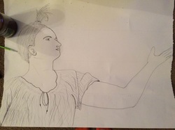 Post #3: After finishing my sketching over the weekend, I put ink to paper and have crated a basic outline of my portrait, next I will add some more line quality and shading.
|
AuthorWrite something about yourself. No need to be fancy, just an overview. Archives
May 2017
Categories |
 RSS Feed
